Introduction
My relationship with the natural world is minimal as I live in London, a more urban area but when I go up North to see family I do enjoy going on walks. To see a landscape, I would go to Greenwich park to see the skyline of Canary Wharf. People take pictures of nature because they are untouched, and change over time. Photographs change the way we see things because there is a lot you can do with an image after it's been taken - a photo can be modified and edited and altered to make it look completely different from how it looks in real life from the same angle.
When I hear the word "landscape", I think of the framing of a photo; what it's representing and what can seen where in the image. These are the words I associate with landscapes:
|
|
My ideal landscape is the view from my window only slightly altered. From my bedroom window you can see Canary Wharf to the West so when the sun sets sometimes it's a really nice view. But I live across the road from a school and that school has a massive tree that block the view of more of the London skyline. I really don't like this tree.
I've taken many landscape pictures from the view, they all look pretty much the same except the different times in the year and day they were taken gives some variation into what the sky looks like.
|
These are some pictures of images I found when googling landscapes:


I went out to replicate some landscape images, but without including buildings but that proved to be quite difficult so I tried to zoom in on a lot of green areas and bushes/trees.


If I were to do this again I would not exclude buildings and infrastructure as I felt it limited what I could do with my first time experimenting with landscapes in this course. I would think about using the rule of thirds to compose and frame my images, while trying to include both urban elements, natural features like plants and trees and parts of the sky.
What is a landscape picture?
When defining a landscape picture, you have to think about types.
One is focusing on landscape as a format in framing; this is a picture where the length bigger than the height of the image - the opposite of this picture is a portrait. Both of these images get their name from the stereotypes of what both aspects are used for: Portrait is name what it is due to the taller height, making it easier to frame around a person's torso or full body and take portraits while Landscapes are more wide than they are tall, this makes taking pictures of skyline or cityscapes or mountains a lot easier.
The other type of landscape picture (the one Dafna Talmor focuses her work around) is an image of a landscape, with it being the subject of an image. These images can be taken in both aspects of portrait and landscape.
Dafna Talmor
Talmor is a London based photographer who's work focuses on a lot of photographing, modifying and constructing landscapes from other pictures of different environments. Her whole career in photography has been centred around these ideas, she takes these images on film cameras then cuts them up and collages them together, during the printing process, she upsized them to be the size of full canvases. Talmor takes her landscapes in landscape format then after, rearranges them into both portrait and landscape.


|
|
This video interview shows her process in both thinking about her work and the planning that goes into the composition, and it also shows the physical process she uses and the equipment that is needed to create art like hers.
Talmor's official website, which has information on her work - and also slideshows of her different pictures in her Constructing Landscapes galleries
|


Homework


I took twelve pictures of the landscapes around where I live but I didn't save half of them after I took them. I'm going to take 6 new pictures in a lot of more different places, to make up for the images I've lost. I focused on and used the rule of thirds to compose my skylines, trying to make 2/3 of the image as the sky and I framed the picture around the street lights and buildings going upwards.
Landscapes from slides


What I liked about Dafna Talmor's work is how she created her own image and landscape (or how she said 'Utopian space') using images of different landscapes - as she said in the video linked above, "There isn't one perfect frame'. Especially after going through Talmor's book, I liked how she used different colours and photographed different places around the world to make her different projects and construct the landscapes.

The Idea of Landscape
The purpose of a landscape picture is to document an area or place. The artist chooses to include things that are personal to them and represent something about how they see the place; maybe when Roger Fenton took the picture on the right, the place he photographed meant something to him. In the example on the right, the photograph is taken from what looks like a path going up to the top of this hill - and on the left, the picture is being taken from a distance away but on the same level as the subject. In the left example, the landscape seems quite close but the camera could always just be zoomed. While on the right picture, the landscape is quite close to the photographer as he could literally just start walking up the pathway and he would be in the mid ground of this frame. In Roger Fentons photo, it feels quite simple and peaceful, as it's monochrome and is quite faded and feels older. Whereas in Prince's picture, the framing of the horse running across the landscape on the flat ground reminds me of a still from a Western movie so it feels quite intense and like the picture was taken in the middle of a very dramatic moment.


We set out to take 12 bad landscapes - this included me over exposing the pictures, taking pictures with things in the way or just taking portraits.


I don't necessarily think any of these images are bad but as landscapes these are. In a lot of these photos I tried to block the view of the landscape and some others I took out of focus pictures or focused on the wrong thing. These I like how these turned out as it made me think about what makes a landscape
Constructed Landscapes


I used a picture I took for homework a couple weeks ago and cut out the buildings I saw to create my template. I then went around the concourse and field to


I like how i got a wide rang of different parts of the school in the background of this landscape. You see several parts of the field in each photo as the location they were taken at varied for each picture. If I were to do it again I think I would take more pictures with buildings outside of school in the background, I think they give the pictures a lot more depth and things to look at in both my foreground and the background - the school buildings all look the same and don't provide much variation to the pictures.
V&A Trip - Known And Strange 12/07/22
Last week we went on a trip to the V&A gallery in London, there we to see an exhibition called Known And Strange, inside we saw numerous different landscape photographs. There were pictures from artists like Tyler Mitchell, Tereza Zelenková, Paul Graham, and Dafna Talmor.

|
"A photograph has the power to transform the familiar into the unfamiliar, and make the ordinary extraordinary. Since its invention, photography has changed the way we see the world by inviting us to interpret reality in our own way. Its creative capacity to blur fact with fiction is the focus of this display."
|


These are works from an artist called Tereza Zelenková. I liked her work with landscapes because of how melancholy and brutal they looked. I was drawn in by the contrast between the black and white in the larger pictures like The Unseen and Byčí Skála Cave, and when I took a closer look at the smaller pictures, I liked the softer greyscale tone to them like specifically Tripod.


Another artists I liked was Paul Graham, his work was different to Zelenková's in that it incorporated and welcomed colour, but it wasn't over saturated or particularly busy. It gave a sense of realism and I felt it kept the same brutal aesthetic as the previous artists work.


We were tasked with taking some creative pictures on our way back to the station after leaving the V&A. These are my favourites, we only walked around a couple streets in a circle before heading to the station so a lot of these pictures were taken on the same roads and look quite similar because the architecture looks the same.
Tereza Zelenková
|
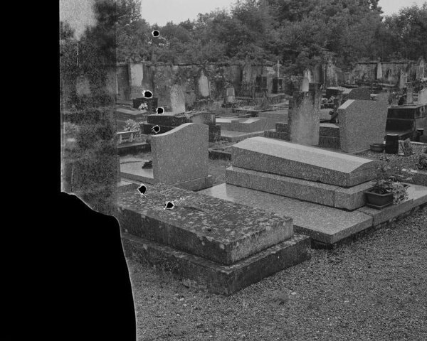
Out of all the artists I saw in the V&A, I really liked the work of Tereza Zelenková. I liked the dirty and direct look of her pieces and felt there were stories behind each one of them. For example, the picture called 'George Bataille's Grave' from her 2013 collection 'The Absence of Myth' brought a lot of curiosity and wonder to me as I had many questions like why George Bataille is so important and why is the picture torn/cut. After some further research into the image, the picture is a self proclaimed embodiment of death - the holes and cuts in the photograph are used to convey the tone as it "opens itself up to nothingness, a dark abyss created by the excess of light hitting the photographic paper; the film ripped and damaged violently interrupts the depicted scene and exposes the hollow emptiness, the eternity in solitude - still, non-existant, under the ground, silenced like the image itself".
|
|
Dionne Lee's Constructed Landscape
I thought this video was confusing, of course I could tell what she was doing with a few of the different collages - building landscapes from different images from magazines. I liked a few of these because she used pictures of space or streams or lighting and stuff like that, connecting all of them together to create her own landscape. She used scissors for more precise cuts at more tedious angles, then torn it with her hands to create bigger and more rough edges. Lee layers and hides a large portion of each collage she does, she forms unseen and more subtle landscapes to create different aspects to the same picture.


I first layed them out without cutting or tearing any of the pictures, I thought I'd make a collage that has a line that goes through continuously through each photo to make it look like a lake or mill of something a long those lines. It occurred to me at some point that my collage looked more like a portrait than a landscape so I started re-arranging the composition before I committed to tearing them. I used some spare scrap pieces that the people around me weren't using while I tore my paper to create the final product. I also cut out a picture of a german politician from the back of a landscape picture I wasn't going use and put him in the picture.
Hiroshi Sugimoto

The World Trade Center - New York City, 1997
|
Hiroshi Sugimoto is a photographer and architect whose work reflects his ideas of traveling back in time to recreate the visions of past architects who designed such iconic buildings and landmarks. One of the factors that he used to achieve these unique and unusual aesthetics in this project is taking all of these images purposely out of focus and blurred. The blurring of the whole frame is a tool that create essentially creates a silhouette of the building - no matter how many times a building is painted or renovated, the silhouette stays the same as the original architect designed it to look.
"Everything I make has some kind of historical notation" Though this quote was taken from an interview with Darius Himes about his work in the world of architecture, the reference to time and history is ever present in his other work in photography - especially in this picture to the left; it's an eerie and unsettling picture of the twin towers taken in 1997. The brutal monochrome film, depressive and nihilistic undertones and blurred focus work together with the fact that these buildings just aren't there anymore reinforces the emphasis of historical importance not only in Sugimoto's portfolio but also photography as a form of expression. What if the last picture ever taken of something important was black and white and out of focus? |
Here are some other pictures that he has taken


Pictus Interruptus by Ray Metzker
Rey Metzker is an American photographer known for his experimental and unconventional ways of taking black and white photographs. One of his projects of which he is known for is called Pictus Interruptus. In this collection he takes images, most commonly candid shots of people on the street, and will block the frame with a sheet of paper or object that is out of focus in the foreground. In a number of these photos, I can't even tell what object he is using to interrupt his images, but I don't think thats the point. Though this project is obviously a collection of 2D photographs, his way of interrupting his own work challenges the viewer to literally look past whatever he is using to block the subject and conquer an obstacle he has chosen to put there. This work isn't about the act of interruption in art, it's about the act of overcoming it.


To respond to this, I went about the school using punched and cut pictures I found in the classroom to interrupt the view of the photograph.


|
|
The next week I decided to do it again but with more tools both similar to last times and different. I picked some of my favourites from both weeks and put them in photoshop. I turned the images to black and white, then I played around with the shades of the colours even while the image was monochrome. After that I increased the contrast and decreased the exposure, then added noise to the photo as I thought it gave the image a lot more to look at while viewing it.
|


Minimalist Landscapes: What Remains


These two pictures are both photographs of landscapes using negative and positive space. The image on the left was taken on negative film then cut and dissected, layered on top of some light sensitive paper - and enlarger then makes the print by exposing both pictures to the light. This is why you can see the cut marks from the film that have been printed onto the silver halide paper and the tree is not as dark as the paper beneath the film. The picture on the right was made using a white sheet of paper and cut bits of black card to form the shapes of a bush or garden tools such as, buckets, spades and rakes. Comparing them I'd say I think Nieson's picture to be more minimalist and better for a response, the use of wide blank space is easier to mimic than the greyscale shades and tones in the alternate picture - but I think I like Geraldo de Barros' piece more due to the creative use of collaging film and physically taking out positive space. To respond to these works I formed a landscape using the same method as Nielson - I would then go onto use the darkroom and enlarger machine and print the negative onto sensitive paper. Making a landscape photograph without using a camera.


This is the positive after being exposed to the developer chemical for a minute, the stop for a few seconds and the fix for around five minutes. I like how the central area of the image stayed clear and sharp and as it moves further towards the border of the picture it gets more cloudy and fuzzy. It gives the effect of a foreground and background being present in the 2D composition.

After my first positive, I used made another but instead of leaving the picture in a tray of the developer chemical, I placed my light sensitive paper in an empty tray and brushed the developer over it with a paint brush. The darker areas indicate my first strokes and the less time the marks had to react with the paper before it went into the stop; the lighter the tones of the developer brushstrokes. This more artistic approach to developing the positive reminds me of the album cover to A Moon Shaped Pool by Radiohead, I like this link between music I like and my coursework and I think I'd like to try something else with these themes and techniques.

Takamatsu Jiro - 'Photograph of Photograph'

|
Takamatsu is a Japanese conceptual photographer who from 1972 to 1973, hired an unknown photographer to take images of already developed family portraits of his household. This concept really rests on the border of interrupted landscapes as there are visual blocks between the camera and the subject such as light reflecting off the film forming a glare or reflection. The idea of how people can interpret instructions following another persons thoughts interested Jiro, he left all decision making to the artist he had appointed as long as they followed his rules of the images being obscured by reflection and/or glare.
|


I think to respond to these I will instruct my friend to take pictures of me and other people in groups on a digital camera, then I will take these images into photoshop turn them to digital negative, removing any greyscale to then take the printed images into the dark room and create positives with the enlarger machine. After that I want to scan it using the printer then download it on my laptop, I'll recolour it in photoshop and display them on a wall.
My first response to Jiro's work


Following the instructions I had set my friend, he had taken a total of 10 pictures of me and my firends, one of which I'd chose to turn into a digital negative then develop in the dark room. I had a few trials with my positives, they often came out too fuzzy and too underveloped but my final positive was just focused enough to properly see the subjects face.


My second response to Jiro's work
I reviewed my work a week later and started to question if what I had done really fits within the boundaries of Constructing Landscapes. I follows Takamatsu Jiro's technique very accurately but the project that I've been mimicking isn't appropriate for my project so instead of instructing a third party to take portraits, I looked back at old work that I've taken throughout Constructing Landscapes and chose one picture from Pictus Interuptus to go and re-use under different instruction. I wanted to use my old work with different purpose rather than outsource my work to a friend - so in that sense I think I'm still paying homage to Jiro's conceptual work.


Collaging landscape
Inbetween lessons, I took an A4 sheet of blank paper and ripped certain pages out from a magazine I found in the art department go create an image of a landscape featuring grass, a house and the sky.

Darkroom prints scanned


These are the picture I chose to take into the dark room, next I want to colour them in photoshop. I took 2 pictures from Pictus Interruptus, one picture from the trip to V&A and the collaged landscape.


After I did this, I projected them onto a blank wall and photographed that as the display.


A personal response to the trial processes
I decided that the second picture (the collage) worked best so I went onto make another one to repeat the same process inspired by a normal skyline picture I had taken a year and a half before. The picture that my collage is inspired by is the view from my bedroom window, I think this will make it a more personal response to the process I've been following in these last couple weeks.


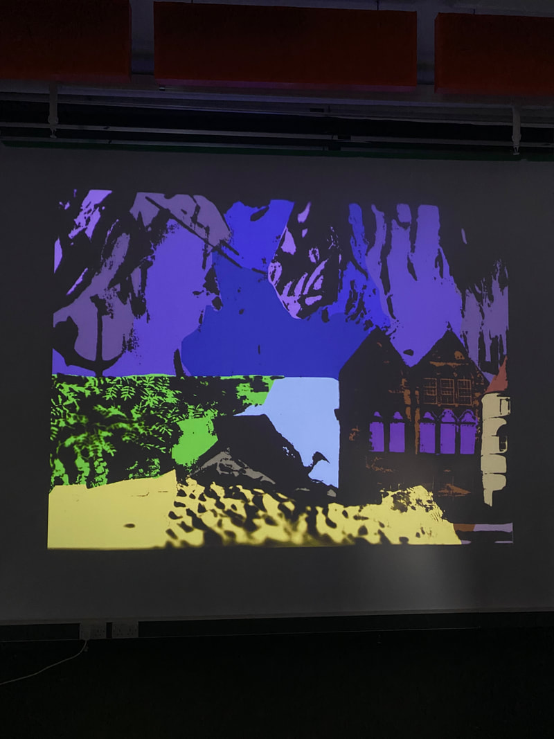
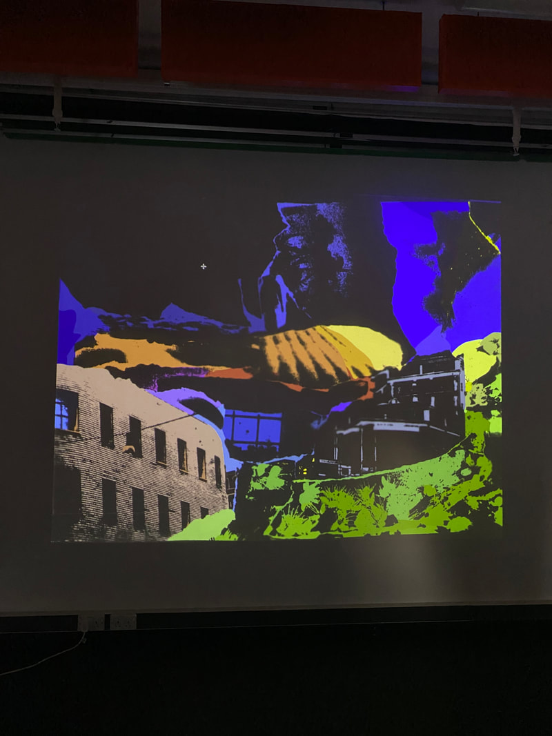
After I put it together, I scanned the sheet using the printer and then downloaded it onto my laptop. From there, I dropped both pictures into photoshop and used the Adjustments tools: threshold (to rid the image of any greyscale, making it completely monotone) and invert (to change all the blacks to whites and whites to black) making it a paper negative.


My first two prints weren't as successful as I would have liked - the edges were blurry due to the paper lifting and it spent too little time being exposed under the enlarger machine. But on my third attempt, I set the time of exposure to around 7 or 8 seconds, and carefully placed a glass panel the same size as the light sensitive paper on the other side of my A4 digital negative. I also turned my A4 page over so the blank side was visible to me, I saw this as a bit of a gamble as I couple not see where the photo negative and the light-sensitive paper lined up so when I started developing the image I had to wish for the best. Luckily, the glass panel helped to create a sharp and detailed image and the long exposure time caused a very clear contrast in the picture between the positive and negative space.

For my third and final piece I wanted to progress with my idea of making my response more personal so instead of following a picture that I've taken (I felt that it limited the shapes I could make) I only used pictures I've taken that I've found on my phone over the past 6 or so months.


|

|
Out of the three images I made in the dark room again I think my third attempt was the most successful as when I compare them all next to each other, all the small details in the buildings and textures are sharper and more defined. After being scanned on the printer, all three of these were less contrasted than I would have wanted but it wasn't really noticeable until I coloured the picture in photoshop - the colours are visible through the negative space when they should be covered by it.


Projections of my responses

To fix the problem with the colours visibility through the negative space, I've been projecting my work onto a white wall to present it as the dark spaces full block the colour. I want to take this medium and enlarge it across the school when it gets dark around 4 to 4:30 by taking the projector and images around to different wide flat spaces displaying them as large as I can. I think I'd like to take images of people walking across at different distances from the projector to create the effect of people walking through the constructed landscapes - hopefully if the varying distances from person to person will create unusual sense of scale as some shadows will be bigger and smaller than the others.
Larger scaled projection


I took the projector to a drama classroom and displayed it on the wall. I then had my friends walk past the lends and around the room as the different pictures were projected onto them. I liked this effect of 3D interactions within a 2D space because as I thought, the chemistry between them and the artificial environment around them caused them to look as if they were walking through the landscape.
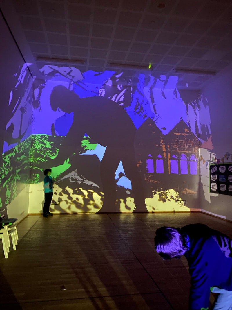
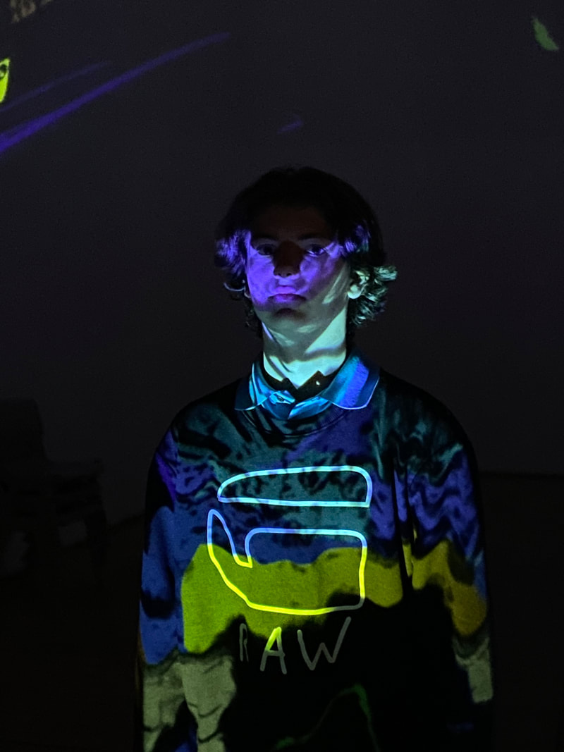

These are my favourite pictures from the photoshoot. The first because I think it shows how unorthodox the scale could be - if the wall is the canvas and I put one person right near the projector his silhouette becomes part of the environment around the other person exploring the picture up close. I really like the second picture, because by positioning the projector right by the subjects feet I am then able to push part of the landscape onto the subject of a portrait picture; I really liked the idea of turning my process inside out by taking a picture of a landscape in a person and not the other way round like the picture following this one. My third favourite is pretty simple but that's why I like it - I think it's the best of all the normal pictures I took in the photoshoot and that it really presents the ideas I'm trying to convey.
